Creating a Strategic and Impactful Email Campaign to Effectively Highlight and Promote Pepsi’s 2024 Workwear Collection

client overview
G&G Outfitters is a leader in branded merchandise and promotional products. They partnered with Pepsi to deliver high-quality uniforms tailored for employees across various roles, such as sales, drivers, and warehouse staff.
Objectives
Objectives
Objectives
Pepsi required a visually compelling email campaign to promote its new uniform collection internally. G&G Outfitters sought a design that would meet Pepsi’s branding expectations while driving user engagement and conversions.
How might we balance bold visuals with functional usability to create an engaging design?
How might we prioritize mobile-first design while ensuring a seamless desktop experience?
How might we showcase multiple uniform products in a clean and organized way?
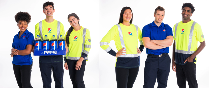
Pepsi employees, including drivers, sales representatives, merchandisers, and warehouse workers, who rely on uniforms for daily tasks.
Brand Analysis
Reviewed Pepsi’s branding guidelines, focusing on:
Identified Pepsi’s signature bold and modern visual identity as a central design element.
Competitor Analysis
Studied email campaigns from prominent brands to identify:
User Behavior Insights
Designed for key scenarios:
Conceptualization
Sketched multiple layout ideas to explore different structures.
Wireframing
Developed low-fidelity wireframes to test.
Prototyping
Created high-fidelity prototypes in Adobe Photoshop and Illustrator.
01. Conceptualization
Action items:
Sketched multiple layout ideas to explore different structures.
Prioritized:
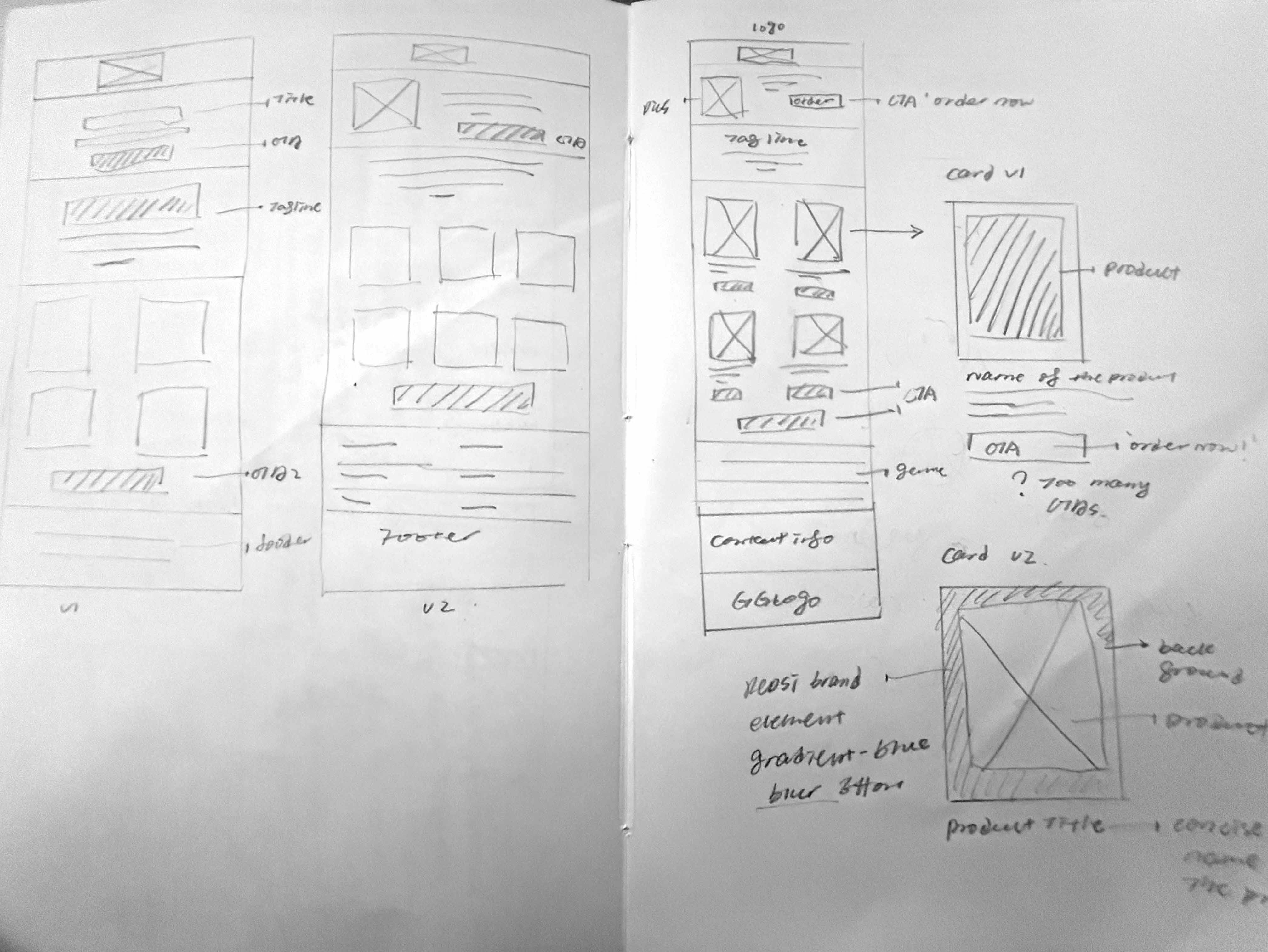
02. Wireframing

Action items:
Developed low-fidelity wireframes to test:
Team’s feedback
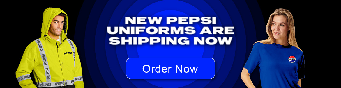
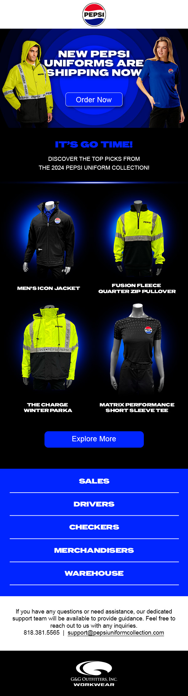
1. Hero Section
2. Tagline and Supporting Text
3. Product Listing
4. CTAs (Call-to-Action Buttons)
5. Footer Design

Featured four key uniform items with product names:
Metrics

Business Impact
Feedback
Challenge
Lessons Learned
Opportunities for Improvement